20th Anniversary - 24 Hour Party People

In Michael Winterbottom’s 2002 film 24 Hour Party People (FAC 401), we follow Anthony H Wilson (performed flawlessly by Steve Coogan) in the unbelievably true story of one man, one movement, the music and madness that was Manchester (thats the films tagline!).

Made with a cinematic burst of that same energy and colour which originally formed from post industrial Manchester’s amalgam of indie rock, burgeoning electronic music, and psychedelia. We celebrating the films 20th anniversary and look back at the graphic design and production of a modern British classic.

Factory Records knew the importance of having a look equal to its sound, and turned that Manchester scene into a red brick terraced cottage industry of music, art, night life and apparel. The graphic elements, in the words of Tony Wilson made Factory’s records the "best designed, best packaged music in the world".

The label had several designers to hand for this very purpose, including Peter Saville and Mark Farrow, London-based firm 8vo, and Central Station Art.

Saville (no relation) tends to garner the most attention, and indeed is now an OBE recipient, yet his legend does proceed him, in-part, thanks to a brilliant running joke in 24 Hour Party People that Saville created works of such beauty that he simply ignored deadlines and costs. In one scene Saville’s character turns up at the end of a gig with the poster meant to advertise it. “Sorry, it took ages to get the right yellow,” explains Saville, “It’s beautiful, but it’s useless, as William Morris once said, ‘nothing useless can be truly beautiful’” Wilson replies. (Saville wasn't consulted by anyone involved in the making of the film, but was interviewed for the DVD extras).

"We used to have meetings where we would consider very seriously paying for a hitman to get the train to London and go and fucking kill him, "Wilson explained in 2004. "There used to be serious meetings to discuss that. I used to get so exasperated I did the artwork myself. There's an example in his book of a piece I did that he says is his own now (Fac 4, a poster, for any Factory completists who care) and it's obvious it's mine. It's shite." This is however refuted on the Use Hearing Protection Exhibition website. (See bellow)

CLICK HERE

.

Peter Saville | 24 Hour Party People interview

.

But, for me there was one group of artists who made the greatest and the best looking contribution to the legacy of Factory Records, Central Station Art.

Michael Winterbottom and Mark Tildesley, 24hrs production designer, may well have felt this too.

When the production was looking for the right look to the graphic design of the film (titles, credits, posters and adverts) they chose Central Station. A perfect collaborator as these where the artist Tony Wilson is quoted as saying, “The second half of the Factory story is best summed up by the painterly eccentricity of Central Station’s, Matt, Pat and Karen.”

For further insight into how this came about and the methods they used to create the outstanding design of the films opening titles, inter-titles, series of end title dedications, the animated colour background for the end roller and trailer and the films posters, here is an extract from a discussion with PAT CARROLL, KAREN JACKSON, and SAM CARROLL of Central Station with the website The Art of The Title.


How did you come to work on 24 Hour Party People?

Karen: The first meeting was with Mark Tildesley, the production designer, and he filled us in on the project.

Pat: I think our reputation preceded us and the main reason for the meeting was to check we weren’t mad before we met Michael, the director. Since then Mark has become a good mate and went on to do us all proud with his work on the Opening Ceremony for the London Olympics with Danny Boyle.

Watch a video of Suttirat Larlarb and Mark Tildesley describing their work with director Danny Boyle here.


What was your first meeting like with Michael Winterbottom?

Karen: We met Michael in the bar at the Palace Hotel in Manchester, where all the crew were based during shooting.

Pat: When we turned up he was still auditioning prostitutes for the scene in the back of Peter Kay’s van! We got on really well and chatted all night about the Manchester music scene.

So how did you begin, with 24 Hour Party People? What was your process for creating this title sequence and the graphics?

Karen: Well, initially there wasn’t going to be a title sequence.

Pat: So we suggested that we could do the main titles — even though at the time we had no experience — just pure passion and love for the artform.


Initial typographic logo treatment for 24 Hour Party People

Sam: Sometimes you have to create a job and pull up your own chair. Moving image to us was an opportunity to extend our comfort zone beyond 2D design — towards creating 24 pieces of artwork a second.

Karen: Michael said, “Go on, then — do me a 13-second leader that will slip into the film.” So we did the leader, but in a moment of madness we decided to stick our necks out! We put together a costly 4-minute main titles pitch — to the Happy Mondays track “24 Hour Party People” — knowing full well there was a big chance we were wasting our time.

Pat: We raided our Factory Records archives for old footage and imagery that we had collected from that time, transferred it all to 35mm, spliced it up into an all-killer-no-filler edit and got painting.

Karen: We thought it should be an art piece — hand-painted, organic, human, emotive. We just believed that when they saw it, they’d change their minds!

When they came up with the idea of painting directly on to the 35mm film, it sounded brilliant but mad to us.

—ANDREW EATON (PRODUCER, REVOLUTION FILMS)


Pat: It was a buzz hearing Michael and Andrew’s messages on the answer machine after they’d seen it. Michael loved it and laughed. He said, “That’s great, but now can you remake it with our footage and incorporate all the credits?”

Karen: After a brief moment of high-fives, we were suddenly struck with the realities of the analogue, hand-made approach we’d established in the pitch.

Sam: The job grew from the 13-second leader into a 1 minute 45 second full title sequence, around 20 intertitles or captions, a series of end title dedications, the animated colour background for the end roller and trailer — oh yeah, and the film poster!

Pat: We met with Michael and looked through everything that had been shot for the film. He supplied us with the original 35mm sections we chose to paint, fuck up, process and potentially destroy…

We would work painstakingly for weeks, painting frame by frame, night after night, making sure we made no errors, no typos, and trying to imagine what it would look like animated — something no one in their right mind would do!

Karen: The only digital fingerprint on any of our elements for 24 Hour Party People was during the editing stage — after transferring our processed film footage.


Original Storyboard #1 – Defining type style, colour and aesthetic for the cards over footage and captions

Original Storyboard #2 – An artistic, painterly layer for the logo and title of the film

Original Storyboard #3 – Painted, vivid technicolour landscapes for all of the elements to live in

Band name interstitial graphics designed by Central Station.

What were some of your influences or references?

Sam: A lot of the reference material was actually life experience.

Pat: Yeah, definitely… It was a pretty crazy time, and we were in the thick of it. We used to live in a house with Shaun Ryder and Bez. We’d go and put in a day’s shift at the studio till midnight, then meet back up with the crew at The Haçienda, ending up at houseparties at The Kitchen in Hulme, shebeens in Moss Side or illegal raves in the middle of nowhere — where we’d often bump into the likes of Bernard Sumner and Ian Brown, sometimes going straight back to work in the morning.

Shebeen is a term that originated in Ireland and referred to an illicit bar or club where alcoholic beverages were sold without a license. The term has spread far from its origins in Ireland, to Scotland, Canada, the United States, England, Zimbabwe, and other countries. The word derives from the Irish síbín, meaning ‘illicit whiskey’.

Karen: Also because we were partly responsible for creating the aesthetic and colour palette of the time — working on the film was a case of rejuvenating and recontextualizing the style we’d become recognised for.

Sam: This is where lack of experience comes in as well — we didn’t know what we were doing and everything was new. Sometimes being unaware of the rules and technicalities can bring about a radical approach. You have to play to your strengths and figure out a process that works for you.

Were there concerns about legibility and the length of screen time for each name? How did you navigate that?

Sam: There was an edge and attitude to everything — no one gave a shit. Worrying about card length and legibility wouldn’t have been in the spirit of the film.

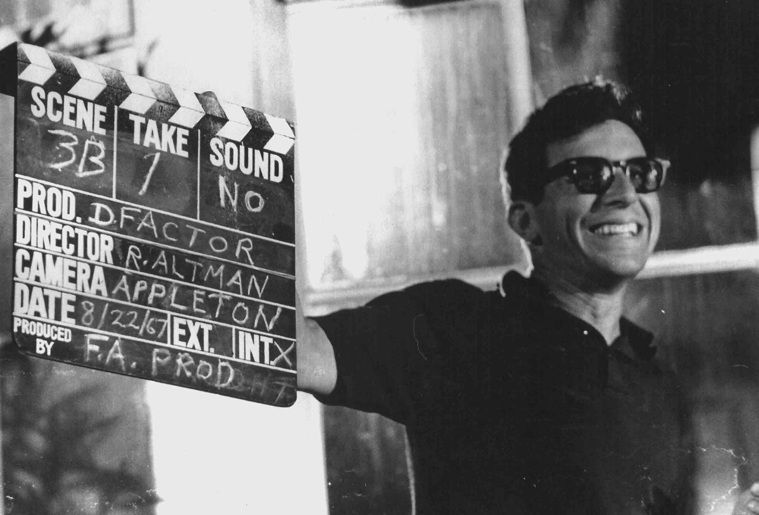
Pot au feu - Robert Altman - 1965

The infamous banned short film, directed by Robert Altman, that features people going about their day while smoking pot. Altman was an advocate of the drug and served on the board of directors of the National Organization for the Reform of Marijuana Laws.

Pot au Feu was shot for just $1000 over a couple of weekends in 1966, but was never officially released. Altman cameos during the chess scene.


Director: Robert Altman
Year: 1965
Country: USA
Language: English
Duration: 9 min
Colour: Colour
Certificate: 15


The World's First Computer Generated Music Video

The world’s first computer generated pop promo? Possibly. “Camoulflage” was a single released by the late Chris Sievey (a.k.a Frank Sidebottom) in 1983, on his Random Records label. Sievey had started programing on his Sinclair ZX81 Home Computer, and included on the B-side of his single, the data (in audio format) for 3 programs to run on the Sinclair ZX81. All of the programs were written by Sievey himself, but most intrestingly, one of the programs was an animated video for the song “Camouflage”. Now, more than thirty years later, here is “the first ever real-time home computer generated pop video.”


"Cinemas in Films" project with Babak Gangei

My collaboration with Babak Gangei on a series of paintings of cinema’s seen in films. Along side a series of James Bond posters from an exhibition titled “Stop Getting Bond Wrong,” where we mixed the titles of Merchant Ivory films ( A Room With A View, Remains of the Day & Howards End) with James Bond posters.


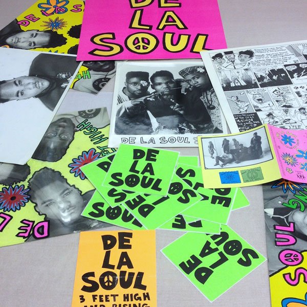
Grey Organisation (Toby Mott) + De La Soul = D.A.I.S.Y.

The Grey Organisation (GO), a collective of like-minded individuals from London who formed from the settled dust of the Punk explosion. GO’s work centred around rebelling against the art establishment, its members dressing in a conservative ‘grey’ manner (hence the name) whilst producing juxtaposingly provocative art that elicited the exact opposite emotions to their attire.

Despite its anti-establishment notoriety, GO’s work was not just created to shock. It designed pieces for the Labour Party in the hope of attracting young voters, and following its move across the pond created album covers for De La Soul and A Tribe Called Quest.

The members of the group were Toby Mott, Daniel Saccoccio, Tim Burke and Paul Spencer. Years active - 1983 - 1991

Toby Mott describes the process of creating 3 Feet High and Rising in an essay written to accompany an exhibition of the work GO produced for Tommy Boy Records: "De La Soul visit our loft where we lay them down on the floor facing up, their heads making a triangle. We photograph them whilst hanging precariously off a step ladder, one idea being that the cover would not have a right way up. CD's have yet to be the dominant musical format so the vinyl album sleeve is our most effective way of making a statement [...] The intent of the design of De La Soul's, 3 Feet High and Rising LP cover is to be new and bright, with the overlaying of the fluorescent flowers and text reflecting a synthetic pop cartoon look [...] This is a move away from the prevailing macho hip hop visual codes which dominate to this day"

Click HERE to watch my De La Soul playlist on WRUBWWM TV


Edgardo Giménez

This is the work of Argentinian artist Edgardo Giménez, who created these incredible pop art sets for two bizarre films, both from 1968, Psexoanálisis and Los Neuróticos. Information relating to the plots of either of these films is hard to come by, so instead, look through these images and make up your own film synopsis.


Allen Jones' Projects Book

A selection of Jones' set and costume designs for a variety of film, stage and television productions. Many of them are humorously 'stamped' as project abandoned. The backstage photographs show a real expanse to the sets, a scale that is often unnoticed in the finished production.


Inspiration from Tove Jansen

The multidisciplinary art and identity of Tove Jansen is a constant inspiration to me. This visual collection of her work and life comprises of images that perfectly illustrates why her profound talent captures my own imagination. From her Moomin illustrations, World War II anti-nazi artwork, Swedish Tolkien book covers, trips to Japan, Moomin’s merchandise and her theatre design work, Tove was an artist in love with creation. And she was a writer too!


Comedy Record Album Design Part 2 - The party record

“Party records were albums that people would play at night after the kids went to bed, records you weren’t supposed to have. They weren’t on the shelves at record stores. You would have to ask for them, then they would reach under the counter and put them in a paper bag. It was almost like you were doing a drug deal!”

Laff Records was the label that really cemented the party record genre in the 60s. Comedians recorded on this blue comedy label included: Richard Pryor, Redd Foxx, Lawanda Page – along with Pipe Layin Dan, Tina Dixon, Skillet & Leroy, and Richard & Willie (a ventriloquist who was described as "Pryor with a dummy"). George Carlin recorded his album, Killer Carlin, on Laff Records.

Integral to the success of the Party Record in the late 1960s was the influence of a mysterious x-rated band by the name of Snatch and the Poontangs, in fact made up of father and son musical legends, Johnny and Shuggie Otis. The release of the filthy folk law psychedelic rock record in 1969 ushered in the rediscovery of traditional african american story telling and jokes, which Rudy Ray Moore aka The Dolemite, would find great success with in the mid 1970s. The Johnny Otis band also promoted and appeared with acts such as Skillet & Leroy.

Party records helped to integrate the stand-up comedy scene. The label worked with black comics who were touring through the chitlin’ circuit. These comedians were ignored by larger record labels. Party records provided that these comedians were wildly popular.- that might otherwise slip through the cracks at a major label.

The album covers, shot mostly by Bud Fraker and Dominic Belmonte, often weren’t even visible. Like the display of pornography at the time, the records were sometimes sold wrapped in brown paper and the words: “For Adults Only.” Often, the covers had photos of topless women with  the nipples covered with stickers which you peel off.

Meanwhile, the back cover had liner notes written in a brilliant carny barker style sales pitch; often written by  Shelby Meadows Ashford, who was originally the record label's bookkeeper: 

“A parade of clowns and jesters…so, like it or lump it, hate or hump it…your lights are gonna be blinking bright over this risqué disc…Blackfolk taught Whitefolk how to dance and then they taught Whitefolk to LAFF…spend another XXX filled evening with another XXX filled album.