20th Anniversary - 24 Hour Party People
In Michael Winterbottom’s 2002 film 24 Hour Party People (FAC 401), we follow Anthony H Wilson (performed flawlessly by Steve Coogan) in the unbelievably true story of one man, one movement, the music and madness that was Manchester (thats the films tagline!).
Made with a cinematic burst of that same energy and colour which originally formed from post industrial Manchester’s amalgam of indie rock, burgeoning electronic music, and psychedelia. We celebrating the films 20th anniversary and look back at the graphic design and production of a modern British classic.
Factory Records knew the importance of having a look equal to its sound, and turned that Manchester scene into a red brick terraced cottage industry of music, art, night life and apparel. The graphic elements, in the words of Tony Wilson made Factory’s records the "best designed, best packaged music in the world".
The label had several designers to hand for this very purpose, including Peter Saville and Mark Farrow, London-based firm 8vo, and Central Station Art.
Saville (no relation) tends to garner the most attention, and indeed is now an OBE recipient, yet his legend still proceeds him, in-part, thanks to a brilliant running joke in 24 Hour Party People that Saville created works of such beauty that he simply ignored deadlines and costs. In one scene Saville’s character turns up at the end of a gig with the poster meant to advertise it. “Sorry, it took ages to get the right yellow,” explains Saville, “It’s beautiful, but it’s useless, as William Morris once said, ‘nothing useless can be truly beautiful”, Wilson replies. (Saville wasn't consulted by anyone involved in the making of the film, but was interviewed for the DVD extras).
"We used to have meetings where we would consider very seriously paying for a hitman to get the train to London and go and fucking kill him, " Wilson confessed in 2004. "There used to be serious meetings to discuss that. I used to get so exasperated I did the artwork myself. There's an example in his book of a piece I did that he says is his own now (Fac 4, a poster, for any Factory completists who care) and it's obvious it's mine. It's shite." This is however refuted on the Use Hearing Protection Exhibition website. (See bellow)

.

Peter Saville | 24 Hour Party People interview
But, for me there was one group of artists who made the greatest and the best looking contribution to the legacy of Factory Records, Central Station Art.
Director Michael Winterbottom and Mark Tildesley, - production designer - may well have felt this too.
When the production was searching for the right look to the graphic design of the film (titles, credits, posters and adverts) they chose Central Station. A perfect collaborator as these where the artist Tony Wilson is quoted as saying, “The second half of the Factory story is best summed up by the painterly eccentricity of Central Station’s, Matt, Pat and Karen.”
For further insight into how this came about and the methods they used to create the outstanding design of the films opening titles, inter-titles, series of end title dedications, the animated colour background for the end roller and trailer and the films posters, here is an extract from a discussion with PAT CARROLL, KAREN JACKSON, and SAM CARROLL of Central Station with the website The Art of The Title.
How did you come to work on 24 Hour Party People?
Karen: The first meeting was with Mark Tildesley, the production designer, and he filled us in on the project.
Pat: I think our reputation preceded us and the main reason for the meeting was to check we weren’t mad before we met Michael, the director. Since then Mark has become a good mate and went on to do us all proud with his work on the Opening Ceremony for the London Olympics with Danny Boyle.
Watch a video of Suttirat Larlarb and Mark Tildesley describing their work with director Danny Boyle here.
What was your first meeting like with Michael Winterbottom?
Karen: We met Michael in the bar at the Palace Hotel in Manchester, where all the crew were based during shooting.
Pat: When we turned up he was still auditioning prostitutes for the scene in the back of Peter Kay’s van! We got on really well and chatted all night about the Manchester music scene.
So how did you begin, with 24 Hour Party People? What was your process for creating this title sequence and the graphics?
Karen: Well, initially there wasn’t going to be a title sequence.
Pat: So we suggested that we could do the main titles — even though at the time we had no experience — just pure passion and love for the artform.
Initial typographic logo treatment for 24 Hour Party People
Sam: Sometimes you have to create a job and pull up your own chair. Moving image to us was an opportunity to extend our comfort zone beyond 2D design — towards creating 24 pieces of artwork a second.
Karen: Michael said, “Go on, then — do me a 13-second leader that will slip into the film.” So we did the leader, but in a moment of madness we decided to stick our necks out! We put together a costly 4-minute main titles pitch — to the Happy Mondays track “24 Hour Party People” — knowing full well there was a big chance we were wasting our time.
Pat: We raided our Factory Records archives for old footage and imagery that we had collected from that time, transferred it all to 35mm, spliced it up into an all-killer-no-filler edit and got painting.
Karen: We thought it should be an art piece — hand-painted, organic, human, emotive. We just believed that when they saw it, they’d change their minds!
“When they came up with the idea of painting directly on to the 35mm film, it sounded brilliant but mad to us.
”
Pat: It was a buzz hearing Michael and Andrew’s messages on the answer machine after they’d seen it. Michael loved it and laughed. He said, “That’s great, but now can you remake it with our footage and incorporate all the credits?”
Karen: After a brief moment of high-fives, we were suddenly struck with the realities of the analogue, hand-made approach we’d established in the pitch.
Sam: The job grew from the 13-second leader into a 1 minute 45 second full title sequence, around 20 intertitles or captions, a series of end title dedications, the animated colour background for the end roller and trailer — oh yeah, and the film poster!
Pat: We met with Michael and looked through everything that had been shot for the film. He supplied us with the original 35mm sections we chose to paint, fuck up, process and potentially destroy…
We would work painstakingly for weeks, painting frame by frame, night after night, making sure we made no errors, no typos, and trying to imagine what it would look like animated — something no one in their right mind would do!
Karen: The only digital fingerprint on any of our elements for 24 Hour Party People was during the editing stage — after transferring our processed film footage.
24 Hour Party People interstitial graphics designed by Central Station.
What were some of your influences or references?
Sam: A lot of the reference material was actually life experience.
Pat: Yeah, definitely… It was a pretty crazy time, and we were in the thick of it. We used to live in a house with Shaun Ryder and Bez. We’d go and put in a day’s shift at the studio till midnight, then meet back up with the crew at The Haçienda, ending up at houseparties at The Kitchen in Hulme, shebeens* in Moss Side or illegal raves in the middle of nowhere — where we’d often bump into the likes of Bernard Sumner and Ian Brown, sometimes going straight back to work in the morning.
*Shebeen is a term that originated in Ireland and referred to an illicit bar or club where alcoholic beverages were sold without a license. The term has spread far from its origins in Ireland, to Scotland, Canada, the United States, England, Zimbabwe, and other countries. The word derives from the Irish síbín, meaning ‘illicit whiskey’.
Karen: Also because we were partly responsible for creating the aesthetic and colour palette of the time — working on the film was a case of rejuvenating and recontextualizing the style we’d become recognised for.
Sam: This is where lack of experience comes in as well — we didn’t know what we were doing and everything was new. Sometimes being unaware of the rules and technicalities can bring about a radical approach. You have to play to your strengths and figure out a process that works for you.
Were there concerns about legibility and the length of screen time for each name? How did you navigate that?
Sam: There was an edge and attitude to everything — no one gave a shit. Worrying about card length and legibility wouldn’t have been in the spirit of the film.

The Central Station design team pictured over 20 years ago in their studio. Pictured (left) are Pat Carroll (standing, back) Karen Jackson and Matt Carroll (sitting) who is holding Sam, Pat and Karen’s son, now in his early twenties (photo David Murphy Photography).
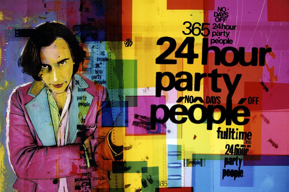
24 Hour Party Marketing artwork.